
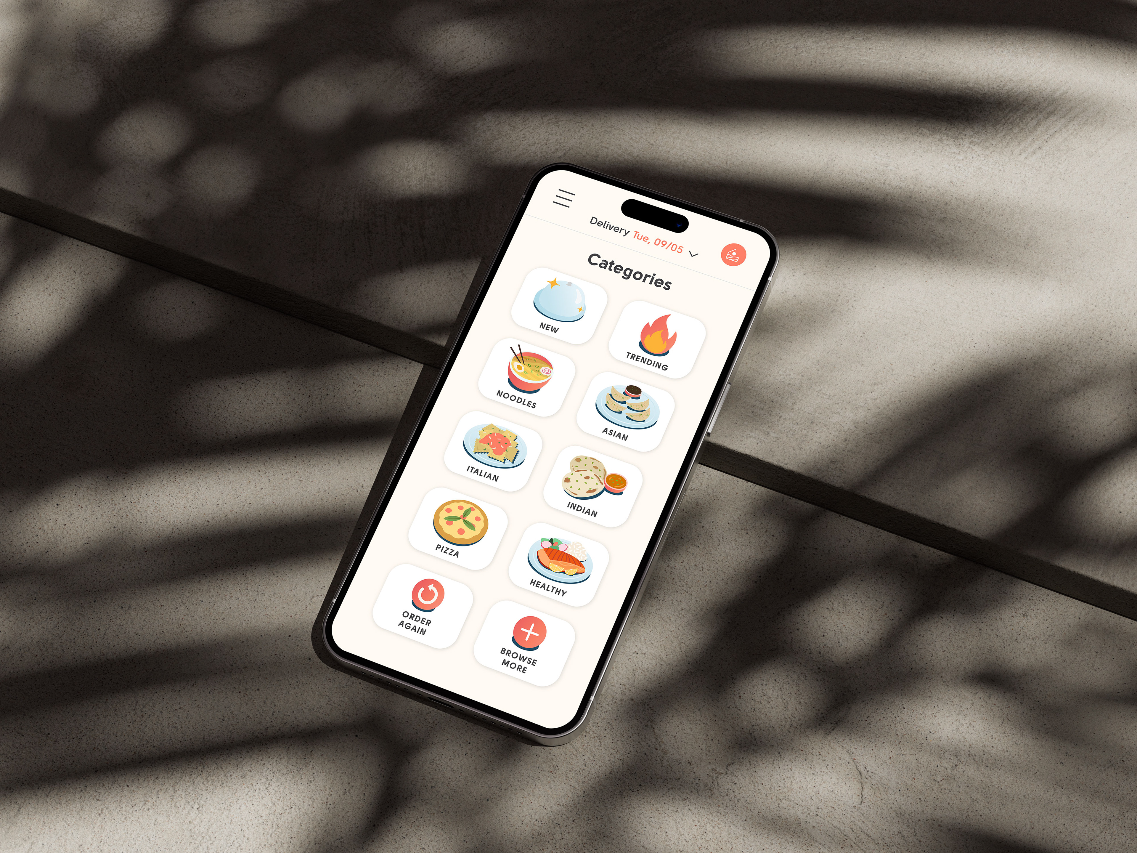
Food Category Icon Illustrations - Dimensional
Project Scope and Objectives
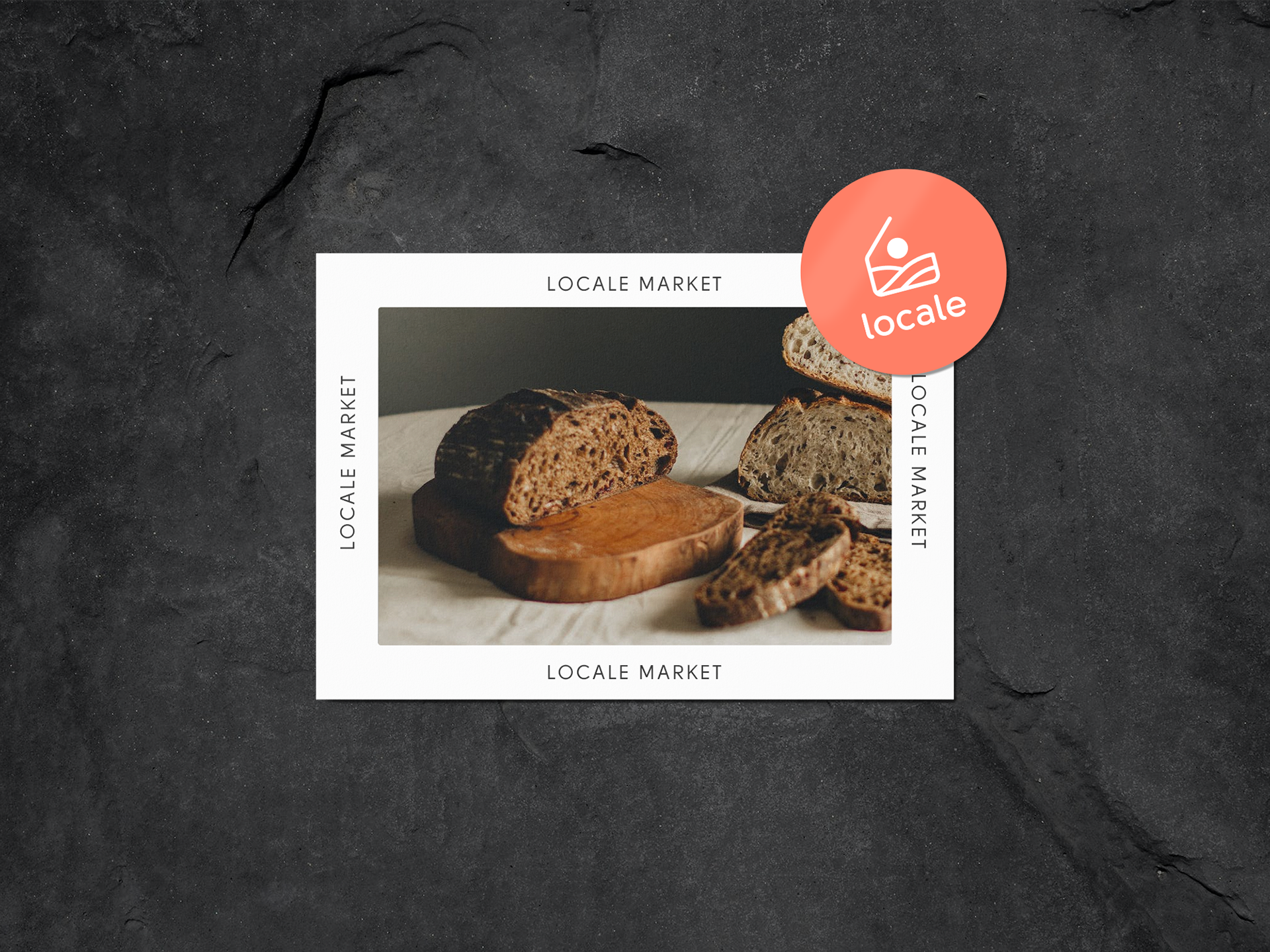
Locale's website hosts a wide array of meals for customers to order at one specific delivery date for only a $5 delivery fee. The primary goal of this project was to develop a set of 16 distinctive food category icons, each encapsulating a specific genre. These icons would not only aid users in quickly identifying and selecting their desired food category but also reinforce Locale's brand as a destination for meal exploration.
User Testing - The icons underwent rigorous user testing to ensure their effectiveness in aiding navigation. Feedback from users played a crucial role in refining the icons, making them more intuitive and user-friendly.
Project Scope and Objectives
Locale's website hosts a wide array of meals for customers to order at one specific delivery date for only a $5 delivery fee. The primary goal of this project was to develop a set of 16 distinctive food category icons, each encapsulating a specific genre. These icons would not only aid users in quickly identifying and selecting their desired food category but also reinforce Locale's brand as a destination for meal exploration.
Design Process
Research and Ideation - The project commenced with an in-depth exploration of food categories commonly featured on Locale's website. A careful analysis of user behavior and preferences informed the selection of these categories. Ideation involved sketching and brainstorming sessions to conceptualize unique visual representations for each category.
Sketching and Concept Development - With a clear direction in mind, I began sketching initial concepts for the icons. These sketches served as the foundation, capturing the essence of each category, from fruits and vegetables to desserts and beverages. Each concept aimed to be visually striking, easily recognizable, and aligned with Locale's brand aesthetic.
Digital Illustration - The chosen sketches were then translated into digital illustrations using vector graphics software. This phase required meticulous attention to detail, as each icon had to maintain a balance between simplicity and visual appeal. Colors, shapes, and typography were carefully considered to ensure coherence within the set.
User Testing - The icons underwent rigorous user testing to ensure their effectiveness in aiding navigation. Feedback from users played a crucial role in refining the icons, making them more intuitive and user-friendly.
Integration - Once the icons were finalized, they were seamlessly integrated into Locale's website, aligning with the overall design and user interface. Their placement was strategically chosen to enhance user engagement and streamline the browsing experience.
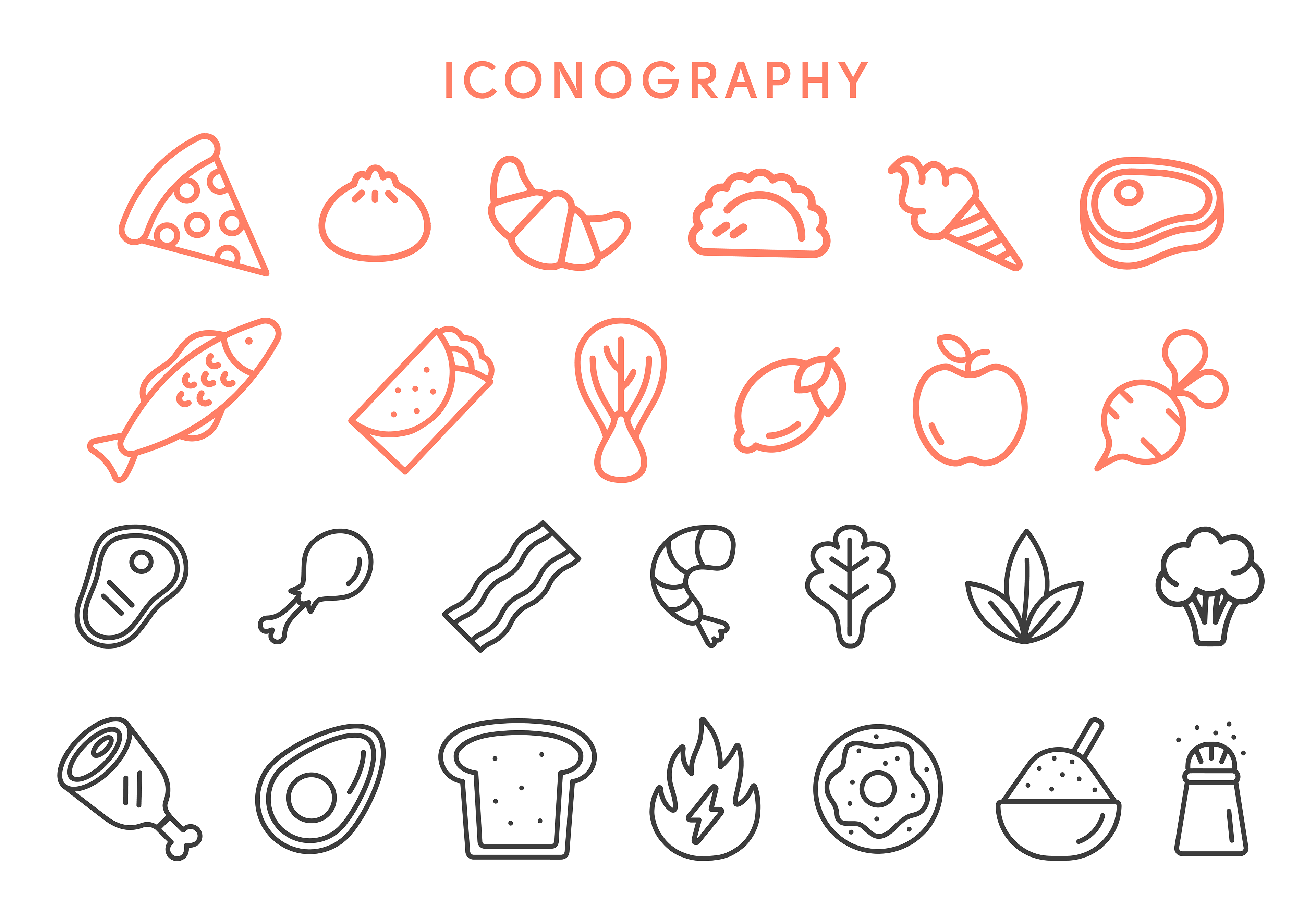
Food Outlined Icon - Flat
Project Scope and Objectives
Locale's branding necessitated a set of flat food icons for consistent integration across various digital platforms, including social media, the website, and email communications. These icons would focus on depicting a variety of food and nutritional symbols while maintaining a sleek, two-dimensional design aesthetic.
Design Process
Research and Ideation - The project initiated with thorough research into the food symbols and nutritional elements most relevant to Locale's offerings and messaging. This research laid the foundation for ideation, where we conducted brainstorming sessions to craft visually compelling representations of these concepts in a flat, outlined style.
Research and Ideation - The project initiated with thorough research into the food symbols and nutritional elements most relevant to Locale's offerings and messaging. This research laid the foundation for ideation, where we conducted brainstorming sessions to craft visually compelling representations of these concepts in a flat, outlined style.
Sketching and Concept Development - With our initial concepts in mind, we proceeded to sketch and refine these ideas. The sketches provided a tangible starting point, capturing the essence of each symbol and ensuring they would be instantly recognizable and align seamlessly with Locale's brand identity.
Digital Illustration - The chosen sketches underwent digital transformation through vector graphics software. Precision and attention to detail were crucial during this phase to maintain the icons' simplicity while ensuring their visual appeal. We carefully selected color palettes and shapes that resonated with Locale's design language.
User Testing - Rigorous user testing was conducted to guarantee the icons' effectiveness in enhancing user experience. User feedback played a pivotal role in refining the icons to make them more intuitive and user-friendly.
Integration - Once the icons were finalized, they seamlessly became part of Locale's cross-channel digital presence. Their placement was meticulously planned to enhance user engagement, provide a consistent visual language, and support easy navigation across social media, the website, and email communication.